Etsy

31/10/2012

A fab feature!

Good evening, I've had a lovely feature today, some of my work has been showcased in the latest Creation is Messy (CiM) newsletter. There are some pretty pictures of my beads and murrini and links to my blog posts about them and also some links to where my glassy things can be found online.

If you would like to be on the mailing list for news of new CiM glass colour releases, glass testers information and more then check out the Creation is Messy Artists registration page.


Also just a little note to let you know that today is the last day to enter my Caramel Creme lampwork bead Giveaway. I'll do the draw and give the winner a shout out on my blog tomorrow.

I hope you have all been having a lovely all Halloween,
Jolene x

30/10/2012

Lampworking for Charity

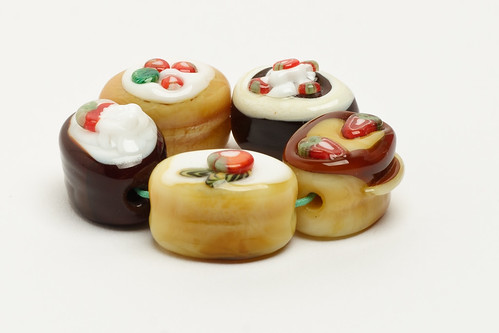
I have a few special listings in my bracelet bead shop for Custom Name Beads. Writing with glass is a skill I have recently taught myself as I wanted to make and donate name beads to Beads of Courage - Be Child Cancer Aware and so it feels right to me that whenever I make a name bead for sale that the BoC project gets a little benefit from that too. I really appreciate the chance to help out a little bit just by doing the thing that I love to do anyway.

I am not the only bead maker I know that likes to lampwork for charity so the rest of today's post is going to be about some of those special beads and the brilliant people that make them and the charities that are dear to their hearts.
Heather made this pair of lentil beads with an olive green base and scrollwork in a minty green


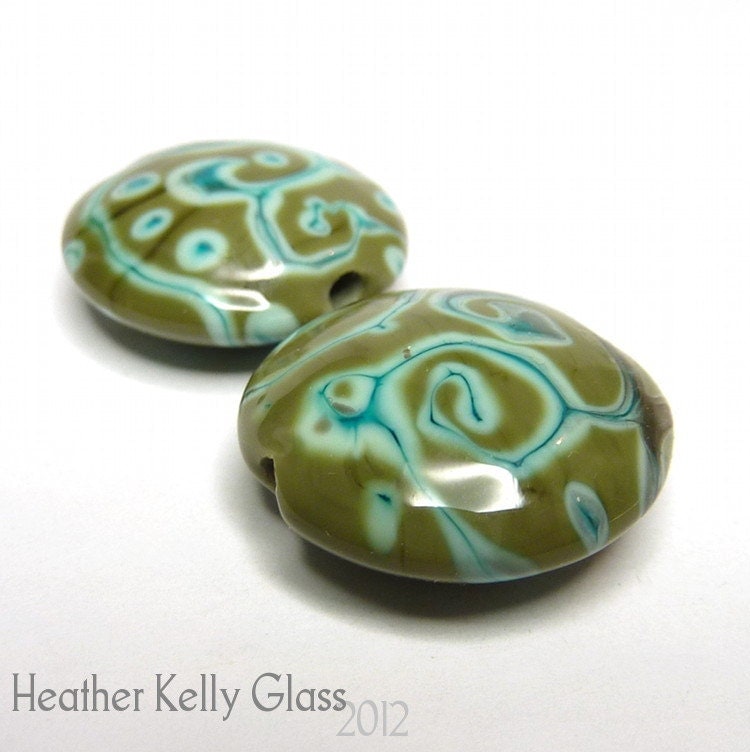
First up are these delightful minty lentils by Heather Kelly who has a special corner in her Etsy shop for OCD-UK (Reg. charity #1103210). Heather writes OCD-UK is the charity dedicated to improving the mental health and well-being of almost one million children and adults in the UK whose lives are affected by Obsessive-Compulsive Disorder. OCD can be so debilitating that the World Health Organisation (WHO) has ranked OCD in the top ten most disabling illnesses of any kind, in terms of lost earnings and diminished quality of life.

Pink Purple Dinosaur Lampwork Glass Bead - Dinos for Diabetes


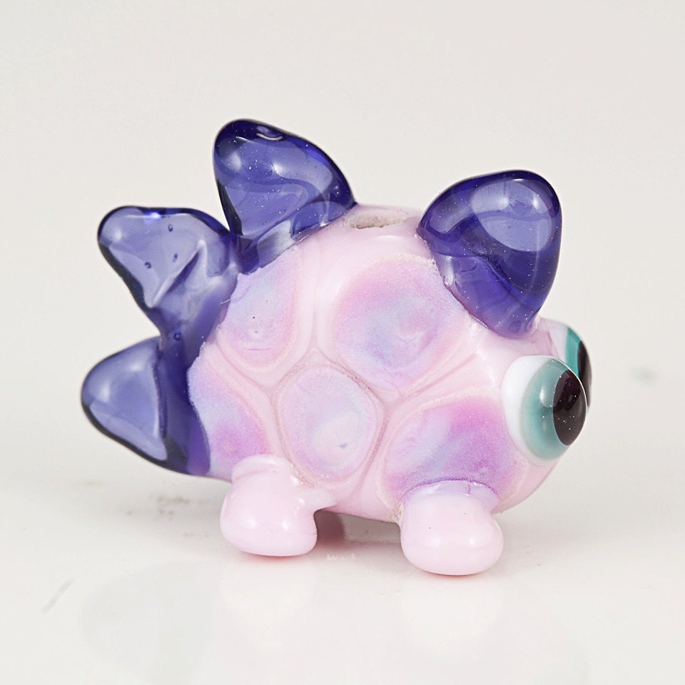
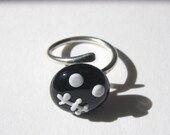
The next fab lampwork bead I would like to show you is this adorable pink dino made by Lauren May Mazursky. Lauren has a Dinosaurs for Diabetes section in her Etsy store and says - he's small but mighty, like a Type 1 kiddo I know. Proceeds from the sales of the mini dino beads will go to the JDRF (Juvenile Diabetes Research Foundation) for a cure.
This is a little black button with a frog's face on it, for Team Jaxon F.R.O.G, on macrame'd cotton. The silver coloured affirmation ring says 'Kindness' which is what this is all about


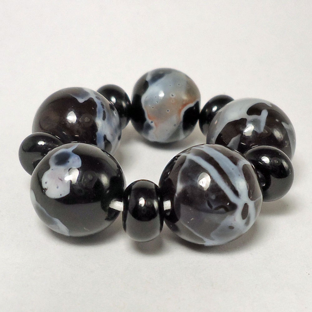
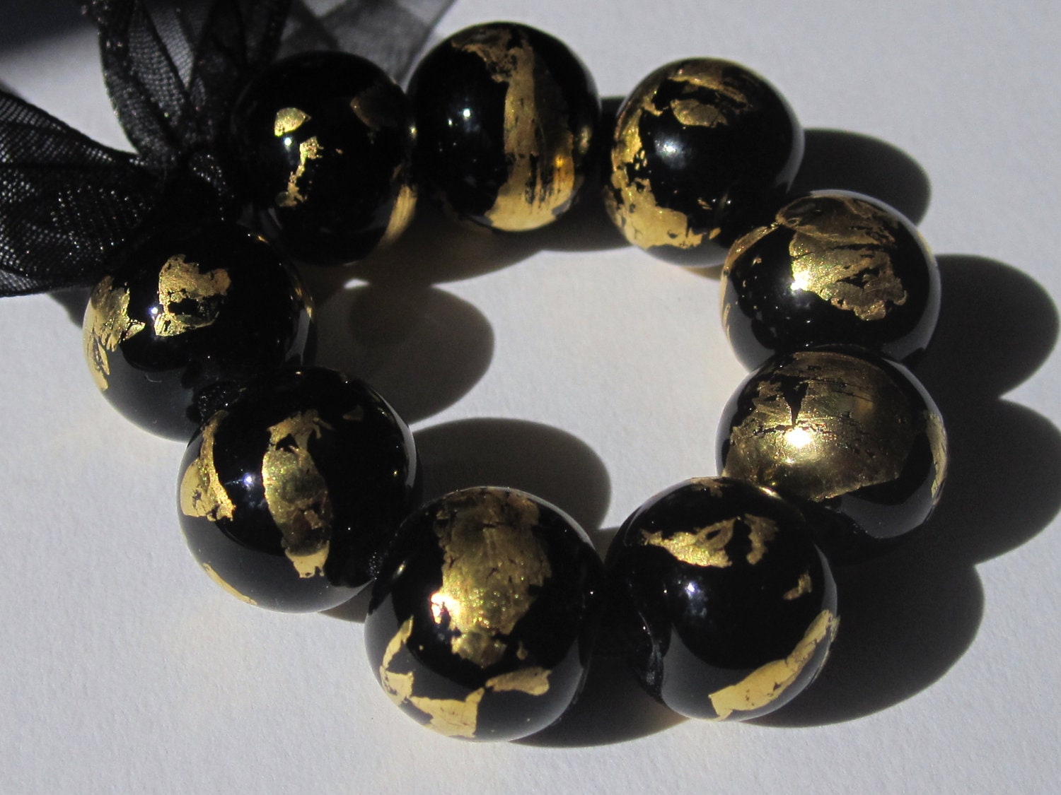
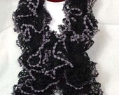
My last shout out for today is for Kat Newman who has designed kindness bracelets to fund raise for Team Jaxon.
You can also find out more about team Jaxon - FROG here on Facebook.

These are just a very few fabulous examples of people turning their creativity and talent into a source of support for causes close to our hearts and trying to make a small difference in our own way.


If you craft to fund raise for a charitable cause close to your heart please feel free to tell me all about it and post a link in the comments section below.

Have a great day, Jolene x

29/10/2012

Blogtoberfest12 and HAF blog

I've been thinking for a long while that I'd like to become a regular contributor over on the Handmade Artists' Forum Blog but was hesitant to put my name in the hat, firstly being uncertain on what kind of regular feature I wanted to share and secondly wondering weather I would be able to find the time to make regular contributions. It would not be a nice feeling to commit to a project then fail to deliver. To prove to myself that I could achieve that goal I set myself a personal daily blogging challenge through October first.

Just a couple of days in to my challenge Kerry, one of my smart and talented Craft Pimp Forum buddies, told me that she was going to be blogging daily in October too for Blogtoberfest12 which is now in it's 4th year. I hadn't heard of Blogtoberfest before and so I signed up to join the fun too. It buoyed me up no end knowing that I was going to be part of 300+ strong group of people aiming to achieve exactly the same goal. Anyhow, I've thoroughly enjoyed this month of daily blogging.....and am a little sad that Blogtoberfest12 is nearly over. Now that I know that there is more than enough time in the day for a teeny bit-o-blogging I've officially joined the HAF blog team and have a proper intro post and everything :-D

Jolene x

28/10/2012

Saturday night is fright night

Here is a little photo montage of what my Ruby (who has just turned 4) and I got up to yesterday evening....it's our very first ever try at making one of these :-D Roo did all the designing and quite a lot of the scooping and I did the grown up helper jobs...


And lastly I logged on this morning to see this spooky treasury by one of my fellow CPteam members and it is so dark and cool that I couldn't resist adding it to my Hallween post.

'On the dark side' by KilnFiredArt

some items for your dark side , mainly from the Craft Pimp team

Black, Grey and Whi...
$15.00

Vintage Button Wedd...
$200.00

Edwardian Black Cor...
$399.00

Handmade lampwork f...
$22.50

Black shawl- Luxury...
$78.00

Deep Red and Black ...
$14.00

Happy Halloween Fus...
$36.00

Midnight Treasures....
$25.00

beaded velvet eveni...
$35.00

Topper - ring/penda...
$10.00

Midnight. Loopy bla...
$10.00

A Pair of Fused Gla...
$25.00

Sorcha
$8.00

Black Surfer Neckla...
$9.00

Black feather epaul...
$19.00

Black Starburst Rou...
$25.00

Happy Halloween folks
Jolene x

27/10/2012

Colour Study - Violet Poppies II

I originally thought to create these colour study posts just during October for my Blogtoberfest challenge and I am really enjoying them for the creative process and challenge. I'm planning now to keep the colour study series as a regular feature on my blog.


This follow up post one is for my Violet Poppies colour study.

From left to right the glass I have selected is:
  1. CiM Sherwood
  2. Effetre Striped Pink 253
  3. CiM Mulberry
  4. CiM Canary
  5. Reichenbach Mystic Grey
I love the set above, though is is more of a collection of nice beads than a cohesive single colour set. There are many reasons for this, all of which a down to my glass selection which in this case I think, was nearly all wrong. I did however learn quite a lot about some of the least used glasses in my stash. There  are two glasses in the quintet above that devitrify very very easily - despite this they both produce stunning colour.

The first I that would like to talk about is Reichenbach Mystic Grey which does not seem to stand up well to several heating and cooling cycles. It was impossible to use this glass as a base for further decoration as the surface between the dots devitrified, looking really quite ugly, as soon as it was reheated. As spacers it is delicious, very classy looking with natural striations and a pearl finish. Under encasement Mystic Grey looks much lighter, muted and silky and very elegant. The other hard to handle glass was the Effetre Striped Pink, at first glance in rod form it looks to be something like a cored cane little sister to notorious EDP (Evil Devitrifying Purple).....and I was right! It is hissy, spitty, bubbly and all round precocious! Thing is though that it looks glamorous all by itself under a clear encasement. The yellow I picked ot turned out to be too translucent and not orangey enough. The successful colours in this study were the CiM Mulberry and CiM Sherwood (fast becoming my favourite green opaque). I will definitely revisit this colour study in the future for a second pass so watch this space for Violet Poppies III!

Jolene x

Frit N Chips lampwork supplies Kitzbitz Art Beads Buzzword Bracelet Beads

25/10/2012

Colour Study - Pink Tipped Chrysanthemum II

The second follow up in my colour study series, this one is for my Pink Tipped Chrysanthemum post. I have been using an app on line called chip it to help me to put select CoE 104 glass colour palettes using my own photos as source material.


The glass I have used is:
  1. Lauscha Creme Brulee
  2. CiM Olive
  3. Lauscha Pink Opaque
  4. Effetre Handpulled Rubino Ora (old batch)
  5. Reichenbach Soft Violet
I'm really very happy with these beads and love these colours together despite the fact that my chosen selection did not include any of the most prevalent hues in the Chrysanthemum image. I really wanted to steer away from making beads that predominantly white and plumped instead for the pale lavender and caramel hues that chip it picked up. CiM Olive in particular behaved wonderfully well, splitting and pooling over the Rubino and both of the Lauscha bases beautifully.

Jolene x

Frit N Chips lampwork supplies Kitzbitz Art Beads Buzzword Bracelet Beads

23/10/2012

Lampwork Shard Favourites.....

I have just listed three of these indulgent shard boxes on Etsy. I don't make many of these and I take my time over designing them. The reason is that I add a few of my favourite shards to these boxes throughout the year, most of the shard recipies are limited edition or designed for the Mini Mo' Club.

My aim in collecting the shards together over a long period of time is so that there is a great deal of variety in these exclusive collections.

There is 2.5g of each of 18 different colours, enough to make  a set and focal at least..........

  • Top Row Sea Heather – Red Riverrock – Strawberry Coulis
  • Middle Row Blueberry Hill – Sedona Park – Mossy 
  • Bottom Row Dawn Chorus – Silvered Banana Cream – Green Goldstone 
  • Top Row Silvered Turquoise – Silvered Petrol Green – Cloudbusting
  • Middle Row Silvered Ivory – Silvered Coral - Persimmon
  • Bottom Row Goldstone – Silvered Slytherin – Silvered Hades

Jolene x

Frit N Chips lampwork supplies Kitzbitz Art Beads Buzzword Bracelet Beads

22/10/2012

Mini Mo' October 2012 - Hey Apple! and Strawberries & Cream

Hey Apple! is named after the catch phrase of a notorious You Tube Character called Annoying Orange with whom my children are smitten. The colourway for this Mini Mo’ for October is elegant and fairly simple, beautiful CiM Cardamom, CiM Split Pea, Effetre dark brown Special 448 and Effetre transparent grass green 022 with Cardamom shards.

A scrumptious trio of iced Ghee apple murrini topped caramel beads....nom nom nom
Not the best picture of this tree bead but the only one I have as it is already winging it's way to it's new home across the Atlantic. It is an encased tree bead with Hey Apple! twistie dots for leaves and blossoms.
This bright bead is a corking great big bumpy focal with a core of Hey Apple! ribbon twistie
My second glasswork collection for October continues along the fruit theme with Strawberries & Cream. I have used lashings of delicious CiM Maraschino with CiM Elphaba and Effetre Angel Pink 261 with Green Goldstone shards.

Strawberry chocolates by Jolene Wolfe
First up here is a super photo of my entry for the GBUK Best of British competition which was taken on the day by Richard Downton. I've used Strawberry slice murrini and Strawberry & Cream murrini to decorate these.
Next up I have a little collection of caramels decorated with some dots and swirls of Strawberries Cream twistie cane berries and icing to show.
My last set of beads that I would like to share today use Strawberries and Cream twistie under a thick layer of Effetre 006 Clear encasement. The clear magnifies the detail of the twistie brilliantly.


Jolene x
Frit N Chips lampwork supplies Kitzbitz Art Beads Buzzword Bracelet Beads

21/10/2012

Colour Study - Fir Tree II

I have recently been using a free app on line called chip it to help me to put together CoE 104 glass colour palettes using my own photographs as source material.


In my first Fir Tree colour study post I took the image top right and selected my favourite 5 colours from the 10 offered to me by chip it and matched them with CoE 104 glass from my stash. Top left is a dotty set I made using just that colour palette. Below right is a bumpy using my Fir Tree colour palette.

The colours I've used are
  1. CiM Fremen
  2. CiM Rainforest
  3. CiM Glacier
  4. CiM Chalcedony
  5. Reichenbach Dense Blue
I'm really quite liking these colours together, but then I have always been a drawn to working with a small section of the colour wheel. There are few things of note happening here, the first is a hint of a reaction between the CiM Glacier and the Reichenbach Dense Blue, there is a thin halo of browninsh purple between the two which looks quite pretty. The other thing is that CiM Fremen seems to pool beautifully in the centre of dots that have been melted flat giving the illusion of an extra layer of dot detail.

Jolene x

Frit N Chips lampwork supplies Kitzbitz Art Beads Buzzword Bracelet Beads

20/10/2012

Homemade light box and the snowman setting....

Ingredients: One empty cardboard box, some white paper, sticky tape/glue, tin foil (optional)

I've been struggling with bead photography for a long time and even brought some snazzy lights a while back but never really got to grips with them. The main problem was really that I didn't understand how a camera works and I had been too timid to take my camera out of auto for close shots. Normally I pop out into the garden on sunny days and take pictures on a backdrop of white paper. I tend take a whole army of shots with my camera on auto and hope that some will be usable. Hit and miss to say the least.


After the GBUK AGM weekend and the wonderful informative workshop given by photographer Richard Downton I think the penny has dropped somewhat in terms of white balance/light sources. In an effort to turn some of that newly digested information into camera confidence I have made a simple light box out of an old cardboard box (something much less classy but similar to the one Richard showed us on the day) and finally try get to grips with my camera. It's not very fancy, a point and shoot Sony DSC-W320 14.1mp cyber-shot.

Ok so the light box ain't pretty but it does seem help, on the left is a photo of one of my Aquarium beads taken outside during the day with my camera on auto, on the right is one taken under studio lighting (a single 5400K, 26W pure white daylight bulb, general colour rendering index CRI>90) in my fancy pants cardboard box with my camera white balance adjusted to compensate (there is a snow scene setting which helps). No image brightening was required, I just cropped the image in Photoshop elements.


As you can see the second image is much improved, though there is still a way to go for my bead photography yet. Now that I have started to understand how important white balance is compared to what the camera captures it means that I can now make use of the quiet time here in the evenings to improve my bead images for listings which is going to be brill!

Richard has written a great article about white balance and exposure compensation for the Frit Happens Wikipedia, you can read it here

Jolene x