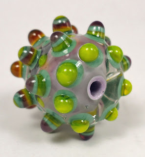
This follow up post one is for my Violet Poppies colour study.
From left to right the glass I have selected is:
- CiM Sherwood
- Effetre Striped Pink 253
- CiM Mulberry
- CiM Canary
- Reichenbach Mystic Grey
The first I that would like to talk about is Reichenbach Mystic Grey which does not seem to stand up well to several heating and cooling cycles. It was impossible to use this glass as a base for further decoration as the surface between the dots devitrified, looking really quite ugly, as soon as it was reheated. As spacers it is delicious, very classy looking with natural striations and a pearl finish. Under encasement Mystic Grey looks much lighter, muted and silky and very elegant. The other hard to handle glass was the Effetre Striped Pink, at first glance in rod form it looks to be something like a cored cane little sister to notorious EDP (Evil Devitrifying Purple).....and I was right! It is hissy, spitty, bubbly and all round precocious! Thing is though that it looks glamorous all by itself under a clear encasement. The yellow I picked ot turned out to be too translucent and not orangey enough. The successful colours in this study were the CiM Mulberry and CiM Sherwood (fast becoming my favourite green opaque). I will definitely revisit this colour study in the future for a second pass so watch this space for Violet Poppies III!
Jolene x
Frit N Chips lampwork supplies Kitzbitz Art Beads Buzzword Bracelet Beads


Really like what you have done with the violet poppies II palette. Thanks for sharing the Chip it programme too. Its fun to see what colours are chosen.
ReplyDelete