Etsy

Showing posts with label colour study. Show all posts

14/01/2018

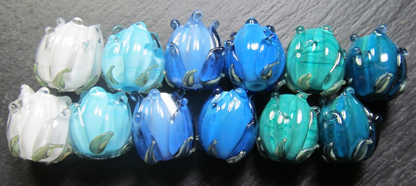
Messy Testing - Colour study in blue

A glass colour study in blue looking at pairs of colours layered up together. The base of these flowers beads is either an opaque or opal glass. The top layer of petals have been swiped on with either clear or transparent glass.


Left to right -
Effetre white with Effetre Clear petals
CiM Freman with Effetre Clear petals
Effetre white with CiM Jet Stream ltd run petals
CiM Fremen with CiM Jet Stream ltd run petals
CiM Mermaid with Effetre Clear petals
CiM Mermaid with with CiM Jet Stream ltd run petals

Jolene xx

Messy Testing - Colour study in purple

A glass colour study in purple looking at pairs of colours layered up together. The base of these flowers beads is either an opaque or opal glass. The top layer of petals have been swiped on with either clear or transparent glass.


From left to right
CiM Primrose with Enchanted ltd run petals
CiM Rapunzel ltd run with Enchanted ltd run petals
CiM Plum with Effetre clear petals
CiM Bubble Bath ltd run with Vetrofond purple 042 petals
CiM Plum Vetrofond purple 042 petals

Jolene xx

17/10/2014

Blogtoberfest day 17 - Colourful Friday


10/10/2014

Blogtoberfest day 10 - Colourful Friday


03/10/2014

Blogtoberfest day 3 - Colourful Friday

27/10/2012

Colour Study - Violet Poppies II

I originally thought to create these colour study posts just during October for my Blogtoberfest challenge and I am really enjoying them for the creative process and challenge. I'm planning now to keep the colour study series as a regular feature on my blog.


This follow up post one is for my Violet Poppies colour study.

From left to right the glass I have selected is:
  1. CiM Sherwood
  2. Effetre Striped Pink 253
  3. CiM Mulberry
  4. CiM Canary
  5. Reichenbach Mystic Grey
I love the set above, though is is more of a collection of nice beads than a cohesive single colour set. There are many reasons for this, all of which a down to my glass selection which in this case I think, was nearly all wrong. I did however learn quite a lot about some of the least used glasses in my stash. There  are two glasses in the quintet above that devitrify very very easily - despite this they both produce stunning colour.

The first I that would like to talk about is Reichenbach Mystic Grey which does not seem to stand up well to several heating and cooling cycles. It was impossible to use this glass as a base for further decoration as the surface between the dots devitrified, looking really quite ugly, as soon as it was reheated. As spacers it is delicious, very classy looking with natural striations and a pearl finish. Under encasement Mystic Grey looks much lighter, muted and silky and very elegant. The other hard to handle glass was the Effetre Striped Pink, at first glance in rod form it looks to be something like a cored cane little sister to notorious EDP (Evil Devitrifying Purple).....and I was right! It is hissy, spitty, bubbly and all round precocious! Thing is though that it looks glamorous all by itself under a clear encasement. The yellow I picked ot turned out to be too translucent and not orangey enough. The successful colours in this study were the CiM Mulberry and CiM Sherwood (fast becoming my favourite green opaque). I will definitely revisit this colour study in the future for a second pass so watch this space for Violet Poppies III!

Jolene x

Frit N Chips lampwork supplies Kitzbitz Art Beads Buzzword Bracelet Beads
25/10/2012

Colour Study - Pink Tipped Chrysanthemum II

The second follow up in my colour study series, this one is for my Pink Tipped Chrysanthemum post. I have been using an app on line called chip it to help me to put select CoE 104 glass colour palettes using my own photos as source material.


The glass I have used is:
  1. Lauscha Creme Brulee
  2. CiM Olive
  3. Lauscha Pink Opaque
  4. Effetre Handpulled Rubino Ora (old batch)
  5. Reichenbach Soft Violet
I'm really very happy with these beads and love these colours together despite the fact that my chosen selection did not include any of the most prevalent hues in the Chrysanthemum image. I really wanted to steer away from making beads that predominantly white and plumped instead for the pale lavender and caramel hues that chip it picked up. CiM Olive in particular behaved wonderfully well, splitting and pooling over the Rubino and both of the Lauscha bases beautifully.

Jolene x

Frit N Chips lampwork supplies Kitzbitz Art Beads Buzzword Bracelet Beads

21/10/2012

Colour Study - Fir Tree II

I have recently been using a free app on line called chip it to help me to put together CoE 104 glass colour palettes using my own photographs as source material.


In my first Fir Tree colour study post I took the image top right and selected my favourite 5 colours from the 10 offered to me by chip it and matched them with CoE 104 glass from my stash. Top left is a dotty set I made using just that colour palette. Below right is a bumpy using my Fir Tree colour palette.

The colours I've used are
  1. CiM Fremen
  2. CiM Rainforest
  3. CiM Glacier
  4. CiM Chalcedony
  5. Reichenbach Dense Blue
I'm really quite liking these colours together, but then I have always been a drawn to working with a small section of the colour wheel. There are few things of note happening here, the first is a hint of a reaction between the CiM Glacier and the Reichenbach Dense Blue, there is a thin halo of browninsh purple between the two which looks quite pretty. The other thing is that CiM Fremen seems to pool beautifully in the centre of dots that have been melted flat giving the illusion of an extra layer of dot detail.

Jolene x

Frit N Chips lampwork supplies Kitzbitz Art Beads Buzzword Bracelet Beads

17/10/2012

Colour Study - Peacock

As part of my blog-a-day challenge for October I am writing a series of colour studies from my own photographs - this image is of the free roaming Peacock that lives in at our local city farm.

I'm using a program called Chip It which is a free app that samples any image and picks out a colour palette using over Sherwin-Williams paint colours. The final challenge for me is to use representative colour palette as inspiration to select a pleasing palette in CoE 104 Glass.....


From left to right I have chosen
  1. Reichenbach Intense Blue
  2. Vetrofond Dark Turquoise 236
  3. CiM Mermaid
  4. CiM Cardamom
  5. Effetre Dark Brown Special
This rich and vibrant teal blue selesction looks fab and is the sort of collection that I had hoped would come out of using Chip It to dissect this image. It is a really very restful colour palette though perhaps a touch of lime green or rich purple would give it a little touch more zing!

Jolene x
Frit N Chips lampwork supplies Kitzbitz Art Beads Buzzword Bracelet Beads

14/10/2012

Colour Study - Pink Tipped Chrysanthemum

The third in my series of colour studies for October is this pink tipped Chrysanthemum. I took the image last week walking back form preschool on a rainy morning.

I'm going to use a free program called Chip It which is a free app that samples any image and picks out a colour palette using over Sherwin-Williams paint colours. The final challenge for me is to try draw out a representative colour palette using CoE 104 Glass.....


The glass I have chosen for this palette from left to right is
  1. Lauscha Creme Brulee
  2. CiM Olive
  3. Lauscha Pink Opaque
  4. Effetre Handpulled Rubino Ora (old batch)
  5. Reichenbach Soft Violet
I think it would have been nigh impossible to put this selection together without the inclusion of the gorgeous Handpulled Rubino Ora. There are so few of these deep rich fuchsia/magenta shades of glass available to buy in CoE 104 glass and my whole selection is two shades lighter across the board than I would have liked to be able to create but I think the relationships between the glass rods is similar to the Chip It palette for this image. 

Jolene x
Frit N Chips lampwork supplies Kitzbitz Art Beads Buzzword Bracelet Beads

08/10/2012

Colour Study - Violet Poppies

The second in my colour study series, looking at creating working colour palettes for CoE 104 Soda Lime Glass from images I have taken on the daily school run or around and about doing everyday things with my children - this one is a picture of some Violet Poppies from our garden

I'm using an app called Chip It which is a free program that samples any image and picks out a colour palette using over 1500 Sherwin-Williams paint colours.The final challenge for me is to select a representative colour palette in glass...


From left to right the glass I have selected is
  1. CiM Sherwood
  2. Effetre Striped Pink 253
  3. CiM Mulberry
  4. CiM Canary
  5. Reichenbach Mystic Grey
This colour palette has worked out really well and has a super kind of feel good factor about it. I love the canary yellow in amongst all of these other harmonious colours and think it simply POPS!

A special thank you to Sue of FlamingEck who has massively inspired this colour study series of blog posts with her Pantone colour matching glass antics.

Jolene x
Frit N Chips lampwork supplies Kitzbitz Art Beads Buzzword Bracelet Beads

03/10/2012

Colour Study - Fir Tree

As part of my blog-a-day challenge for October I am planning a series of colour studies from photographs taken on my daily school run - this one is a picture of some kind of fir or evergreen tree.

I'm going to use a free program called Chip It which is a free app that samples any image and picks out a colour palette using over Sherwin-Williams paint colours. The final challenge for me is to try draw out a representative colour palette using CoE 104 Glass.....


From left to right the glass I have chosen is
  1. CiM Fremen
  2. CiM Rainforest
  3. CiM Glacier
  4. CiM Chalcedony
  5. Reichenbach Dense Blue
This first attempt at selecting a working colour palette from a real image that I have taken myself has been a very interesting process. It feels like I have been playing Chinese Whispers with colour and at every stage my options of colour selection have become fewer. From life to digital capture, then using the Chip It app to massively simplify the image to a selection of just 10 definitive shades from a mere 1500+ options of recorded colour data (of which I have chosen to show just 5). The last simplification is to select my best fit from the glass I have available to me here in my studio which I estimate at best is no more than 200 different shades and hues. What seemed like a mountain of raw materials and possibilities available to me this morning now seems like a drop in a tiny ocean in  terms of real world colour now. Hopefully you see what I see though, a pleasing and harmonious working palette for bead making.

Jolene x

Frit N Chips lampwork supplies Kitzbitz Art Beads Buzzword Bracelet Beads